
Dashboards Chart Progress & Measure Performance On One Screen
More and more, nonprofits use data dashboards to drive effective progress toward their fundraising goals through visualization. A dashboard instantly communicates mission-critical information onscreen–saving your busy team from digging through reports and (possibly) drawing incorrect conclusions.
What IS a (Fundraising) Dashboard?
Dashboards present a lot of critical data upfront on one screen in visuals like graphs, pie charts, and pictorial representations.
Imagine the instant (and shared!) understanding you’ll get when you illustrate essential data such as:
- Real-time progress toward fundraising goals
- Monthly donors and dollars
- Prospect pipeline activity
- …and any other data related to the work of the team
The best part about using dashboards is that they’re accessible–through smartphones, tablets, and other mobile technology–so having an organization-wide view of progress and activity is fast and easy.
Why We Need Dashboards to Stay On Track
A dashboard overcomes the limitations of short-term memory by showing your leadership and your team action-relevant information on one screen. Successful fundraising strategies rely on a lot of data to find and maximize opportunities. Dashboards display real-time data so your organization can track progress toward goals–and make action plan adjustments promptly.
Dashboards for Major Gift Fundraising
The main users of your MG fundraising dashboards are your organization’s leadership and major gift fundraisers. Both audiences want to see current progress toward fundraising and engagement goals:
- Leadership wants an interactive, 10,000-foot view of how fundraising (at individual and organization-wide levels) is performing, like year-to-date giving, campaign progress, gift officer pipelines, and more.
- Major gift fundraisers want to see their fundraising activities against individual performance goals.
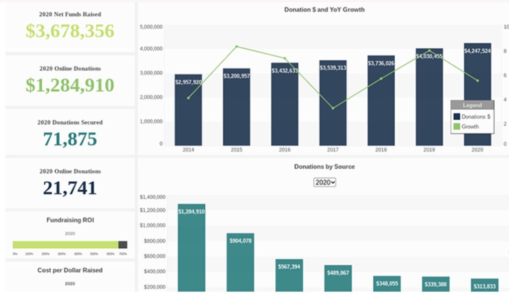
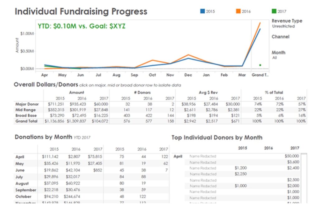
Here are a couple of examples of fundraising dashboards:
What Should Be in Your Nonprofit’s Dashboard?
The data you present in dashboards varies depending on the audience and their needs. Your leadership will want a 10,000-foot view, and fundraisers will probably want prospect-by-prospect detail. Your nonprofit’s dashboard should answer strategic questions that are vital to your fundraising strategies, like:
- How much have we/I raised so far?
- How do we/I measure up to goals?
- How much have I/we raised by donor type (major, mid-range, annual base)?
- What’s the total number of donors overall and in each of the three categories?
- How many outright gifts have we received?
- How many online donations? How many gifts were handed to a fundraiser?
- How many visits/how long did it take to close the biggest gifts?
A data dashboard is more than just a report card on your efforts. When you share the information, like a list of newly qualified prospects, trends in gift revenue, etc., your entire organization stays on track with strategy and action.

What are Best Practices for Fundraising Dashboards? Read Part 2 of this blog post series on November 4th.